History of Currency Designs
The Series 1996 redesign
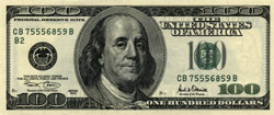
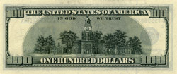
Once again, the $100 note was the first to see the changes. Compared to the 1928 designs, the Series 1996 notes had much simpler engraved borders, creating much more open space in the design and allowing for the addition of a watermark to the paper to the right of the green Treasury seal. The seal and denomination were shifted slightly left to accommodate the watermark. The portrait was also shifted to the left, and greatly enlarged. Below the watermark, the denomination "100" was printed in special color-shifting ink, appearing black when held at an angle but green from directly above. The black Fed seal no longer showed the letter of the issuing Fed district; a single standard seal now represented the Federal Reserve System as a whole--and for the first time since Series 1934D, the Fed seal was engraved into the printing plates rather than being overprinted. The letter and numeral identifying the issuing Federal Reserve Bank, meanwhile, were printed just below the left-hand serial number, and in green rather than black as before. The security strip and microprinting that had been introduced with Series 1990 were retained, but the strip was now treated to glow red under ultraviolet light, and the microprinting was repositioned. On the back side of the notes, a new design was used, but it differed only cosmetically from the previous design, no security features being added.
Over the next few years, the smaller denominations were also redesigned, generally in conformance with the $100. The $50 and lower notes did differ from the $100 in a few respects, however. For one, these lower denominations retained an overprinted, not engraved, Fed seal, though it was the new universal seal rather than the old-style seal with the district letter--and since this seal was overprinted in black, the district letter and numeral were returned to their traditional black color as well. For another, their new back designs all contained one feature absent from the $100: an extremely large denomination numeral in the lower right corner, in simple clear type, intended to be easily readable by those with limited eyesight. Also, a tiny representation of the U.S. flag was added to the printing on the security strip; it had the denomination numeral printed in the upper left quadrant where the stars would normally be found.
Additionally, each denomination's security strip was positioned differently and glowed a different color under ultraviolet light, and each denomination had microprinting in two different locations:
- The $100 note's security strip was located between the Fed seal and the portrait, and glowed red. "USA100" was printed repeatedly within the lower left denomination numeral, and "The United States of America" was printed along the edge of Franklin's lapel.
- The $50 note's security strip was located between the portrait and the Treasury seal, and glowed yellow. "Fifty" was printed repeatedly in both side borders of the face design, and "The United States of America" was printed along the edge of Grant's shirt collar.
- The $20 note's security strip was located between the left border and the Fed seal, and glowed green. "USA20" was printed repeatedly within the lower left denomination numeral, and "The United States of America" was printed four times in the lower part of the portrait frame.
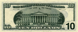
- The $10 note's security strip was located between the portrait and the Treasury seal, but farther to the left than the thread in the $50, and glowed orange. "Ten" was printed repeatedly within the lower left denomination numeral, and "The United States of America" was printed three times along the edge of the ribbon carrying Hamilton's name.
- The $5 note's security strip was located directly behind the Fed seal, and glowed blue. "Five Dollars" was printed repeatedly in both side borders of the face design, and "The United States of America" was printed twice in the lower part of the portrait frame.
The $5 note, being of relatively low value, was printed without the color-shifting ink that was used on all larger denominations. And once again, the $1 and $2 notes were not included in the redesign at all. These two notes were thus left with designs completely different in style than those of the higher denominations--a situation not unlike that of the $1 SC during the interval from 1935 to 1950. This time, however, the difference would not merely persist for an extended period, but would be supplemented by the addition of yet a third style of designs.
Next: Series 2004, and the addition of color
Main Page | History main